
All Dental Needs Center Website Redesign
Role: UX DesignerProject Duration: 6 Weeks
Team: 3 Members (UX Designer, UI Designer, Project Manager)
Tools: Figma, Miro, Google Docs, Zoom
🎯 Problem Statement
Steinway Family Dental Center is a well-established dental clinic with 20+ years of experience. However, its website was cluttered, outdated, and hard to navigate. Users found it difficult to trust the site or book appointments online, affecting patient acquisition and retention.
🔍 Discover
Goal: Understand user behavior, pain points, and the business context.
1. Stakeholder & Business Analysis
The clinic needed a professional, clean web presence to reflect their legacy and attract new patients.
Core issues: Dense copy, pop-up overload, weak visuals, and unclear navigation.
2. User Interviews
Conducted 5 semi-structured interviews with dental patients aged 25–45.
Discovered frustrations around navigation, unclear services, and lack of trust.
Key Quotes:

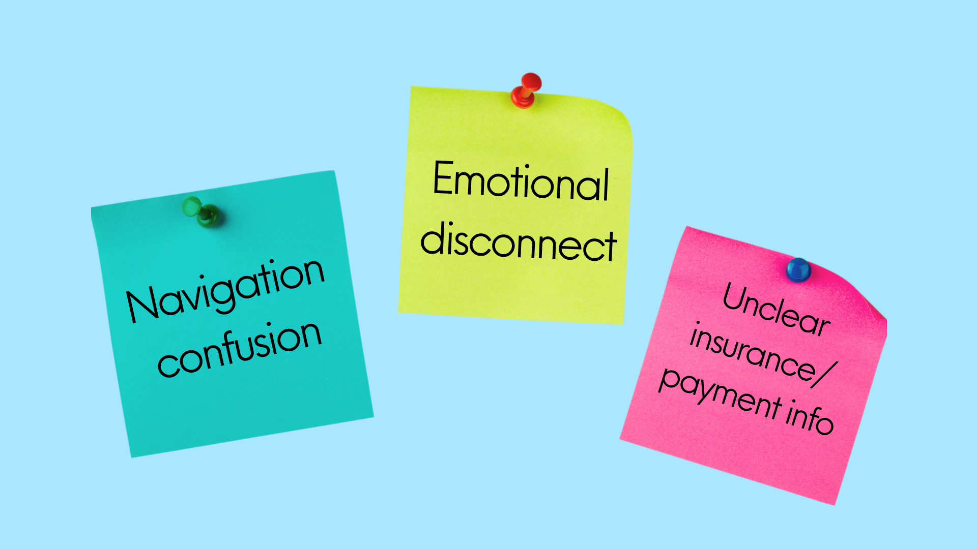
3. Affinity Mapping
We synthesized interview data into key themes like navigation issues, trust-building, clarity of services, and modern aesthetics.
What We Learned:
4. Competitive Analysis
Studied modern dental websites that use:
Clear call-to-actions
Smiling human imagery to build trust
Organized, card-based service layouts
🎯 Define
Goal: Pinpoint core problems and articulate design challenges.
Persona
Vanessa, a 28-year-old real estate agent, represented our primary user. She values:
Easy online appointment booking
Clear insurance/payment information
Real reviews and professional visuals

User Need:
Vanessa needs a website that feels trustworthy, looks modern, and allows her to easily book an appointment without needing to call.
How Might We:
...make the user feel welcomed and confident?
...simplify service discovery and navigation?
...streamline the booking process?
🧪 Develop
Goal: Ideate and prototype solutions based on user needs.
Wireframes
Created mid-fidelity wireframes covering:
Homepage
Services
About Us
Smile Gallery
Testimonials
Contact & Booking
Features Prioritized:
Hero CTA ("Book Now")
Single, clear navigation bar
Organized services section
Patient reviews carousel
Smile gallery for building emotional trust

Mid-Fi Prototype Usability Test

🚀 Deliver
Goal: Refine, test, and finalize the solution.
High-Fidelity Prototype
Refinements included:
Real photos of staff
Friendly, modern fonts and colors
Clear sections for services and insurance
🎨 Key Screens:
Homepage
Doctors & Staff
Smile Gallery
Book Appointment pageHi-Fi Usability Feedback:
Users described the new site as clean, modern, and visually appealing
Users felt more confident booking an appointment
Minor adjustments made to contrast based on feedback
Hi-Fi Usability Testing
4 participants
Feedback: ✅ “Much more trustworthy and clean”
✅ “I’d actually book here”
✅ Contrast and spacing felt more professional
✅ Outcome & Reflection
Impact
Improved user confidence and site trust
Streamlined booking experience
Modernized brand presence to reflect clinic’s real value
Key Learnings
Emotional design (images, language) matters in healthcare UX
Simple, honest layouts often outperform flashy ones
Continuous feedback loops improve outcomes drastically
Next Steps
Test with a wider, diverse patient pool
Add multilingual support
Consider HIPAA-compliant chat integrationConclusion & Next Steps
Test the updated Hi-Fi prototype again for further feedback
Get content accuracy checked by dental/medical industry experts
Explore adding patient video testimonials for stronger emotional connection
Key Learnings
This project emphasized the importance of:
Early user involvement to uncover hidden frustrations
Balancing emotional trust-building with professional credibility
Rapid iteration based on real usability testing feedback
🎯 Impact
By redesigning the website with a user-first approach, we significantly improved the user experience, helping Steinway Family Dental Center better connect with potential patients online.